

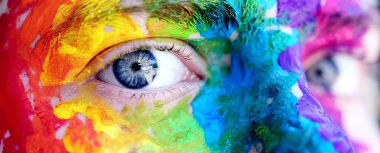
color is what the eye sees when light is reflected off an object. We see different colors because some objects reflect/absorb specific wavelengths. These wavelengths are what the human eye perceives as different colors. Colors play a very important role in our everyday life and the basic color terms used in graphic design isn’t useful to design alone it affects everything.
They can draw your eye to an image, evoke a certain type of emotion or even communicate something important without using words. Color can change the way you think, change your actions, and even cause reactions. It can irritate or soothe you, get you amped up or calm you. As a powerful form of communication, color is irreplaceable.
There are basic color terms used in graphic design which you should know. Knowing these basic color terms helps you look professional and communicate effectively.
Knowing the basic color terms a designer should know helps you look professional.
Here’s is a list the basic color terms used in graphic design
1 Hue
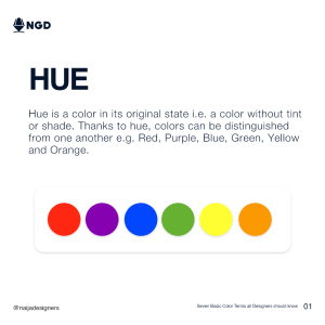
Hue is one of the basic color terms used in graphic design.
Its a graduation of a color or the characteristic that distinguishes one color from another one. When we look at an object, what we see is the hue; the purest form of the color. Hue and color are often interchanged as their definitions almost mean the same thing but they are not. Color is the general term we use to describe every hue, shade, tint or tone we see while hue refers to the purest form of the color we are looking at. So, for instance, light blue is a color and its hue is blue. Hue is a pure color, one without tint or shade and has a 100% saturation. Examples of hues are Red, Purple, Blue, Green, Yellow and Orange.
2 Saturation
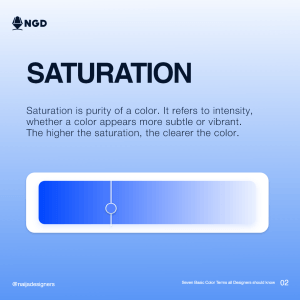
Saturation of a color describes the purity or brilliance of the color. It shows the amount of hue in a color which defines the intensity of the color. When a color appears to be lighter than its hue, we say the saturation is high and when it seems more subtle, the saturation is lowered. By changing the value of saturation in a color, we can get different variations of the color from lighter shades to much more vibrant and darker shades. If a color has all of its saturation taken out, we see the color like a shade of grey, ranging from black to white depending on the saturation of the hue originally. So black and white photos have no saturation.
3.Shade
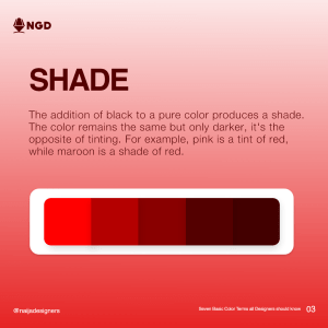
A shade is produced by adding black to a pure color. The main color remains the same but just appears darker. The higher the saturation of the black added to the pure color, the darker the shade of the color becomes. When thinking about shade, imagine a straight line which has the pure color(hue) on one end and black in the other end. As you move from the pure color towards the black, you are creating shades of the color. For example, maroon, crimson, burgundy are all shades of red. This is basically seen as the opposite of tinting which is going towards white as opposed to black.
4.Tint
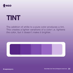
Just like with shades, a tint is produced by adding white to a pure color. The brighter the color appears the higher the tint. So, on our imaginary line, we would be going towards white from the pure color not black as in creating a shade. The closer we get to white, the higher the tint of the color would be. Colors like pink and peach are gotten from tinting the pure red color. Tinting a color creates lighter variations of the color which could really come in handy when trying to complement colors in a design.
5.Tone
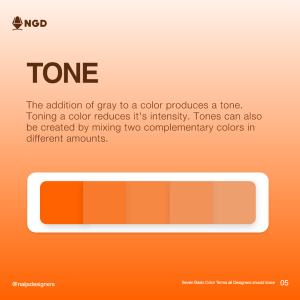
The addition of grey to a pure color produces a tone. Toning a color reduces its intensity and takes out all of the vibrance from the color.
You would probably tone a color if you plan on using it as a complement to another color or as a background to make something else stand out. Apart from that, toning down a color just takes all the feel out of the color so it should be used carefully. Tone color and toning a color should not be mixed when speaking because they mean different things. Tone color is a musical term that describes the quality of a musical note while toning a color is reducing the intensity of a color by adding grey.
6.Value
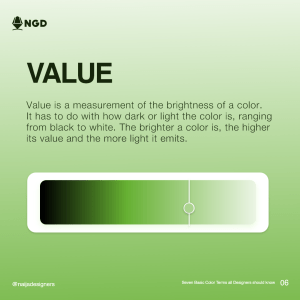
Value refers to the measurement of the brightness of a color.
It has to do with how dark or light the color is, ranging from black to white with black having the lowest value and white having the highest.
As said above, adding black, white or grey can affect how a color looks. This also affects the value, as pure colors with black added to them, would have a lower value and adding white would increase the value of a pure color. Even without adding white or black to pure colors, they still have values based on how much light is reflected off them.
For example, orange or yellow have higher values than darker colors like blue or red. Basically, the brighter a color appears the higher the value of the color.
7.Contrast
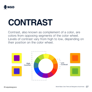
The degree of difference in two or more colors, is known as a contrast. Contrasting colors are colors that are different from each other and the degree of contrast depends on their position on the color wheel. Complementary colors, which are colors opposite on the color wheel like blue and orange, or red and green, give the highest level of contrast while colors closer together do not have as much contrast. Using contrasting colors in design can make your piece stand out, ideally, you’d use one as the background and the other one as accents. Colors closer together on the color wheel also give beautiful combos as they can make beautiful color pallets for your designs.
We’ve only just scratched the surface
There are different terms for describing the qualities of color. This can be confusing as they sometimes overlap or are even interchangeable depending on context.
The above basic color terms used in graphic design as explained above are enough to make you sound like a pro and make the right color choices!
Having a hard time remembering these terms? Luckily there are online tools for choosing the right color for design projects that apply these terms for you.
Its however great, if you have a basic understanding of them yourself.
Here’s a recap of the basic color terms used in graphic design
- Hue
- Saturation
- Shade
- Tint
- Tone
- Value
- Contrast