

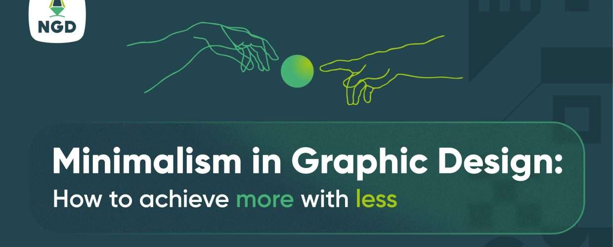
The art of conveying the essential essence is a skill required in all spheres of life. Its importance is craved since what is unnecessary is always disturbing. This sacred art is called several terms e.g. less is more, simple is better, and in design, it’s called minimalism. And while it’s regarded as a graphic design trend in 2023 its use in design can be traced a hundred years back with Japanese priests in Zen gardens and the world war 1 Bauhaus movement.
So What is minimalism in Graphic design?
While old books like the bible refer to using fewer words in statements Minimalism in graphic design emphasizes fewer elements!
The availability of fonts colors and shapes tempts the use of more than we need. Minimalism in graphic design, however, encourages the use of less; fewer colors, fewer fonts(1 mostly) few shapes, and overall balance without any element taking predominance.
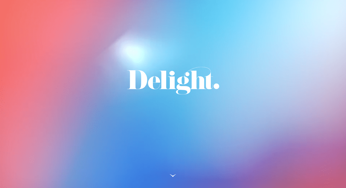
Image credit: Design shark
A simple gradient background and a simple font are all that’s needed to make “delight” the hero of this design.
Minimalism principle in graphic design is not over-simplified or mediocre
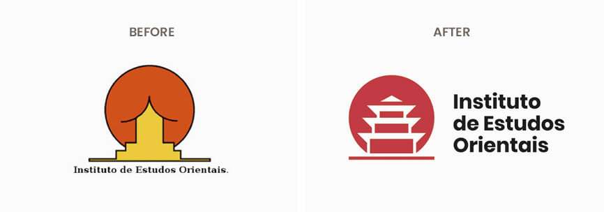
Image credit: Pinterest
The art of using the barest minimum can when done wrong lend itself to mediocrity.
The Institute of the Orientals is an example of bare vs simple. By using strokes for the pagoda a more elaborate but simple logo is created. The font in bold text aligned with the shape further lends a strong visual appeal.
it’s easy to call it a day with few elements but if users of a design can’t find your search bar then minimalism hasn’t been achieved and if a UI lacks accent colors to denote important actions then minimalism isn’t at play!
The minimalism concept encourages using everything a design needs e.g. search bars, icons for accessibility, and subtracting elements a design can do without.
How to know if your graphic design is minimalist
The minimal concept in your design might lead to simplification here are three guides for fact-checking your minimal design
- All elements serve a purpose ( not a universal purpose like saving the universe but a design-oriented one)
- The only outstanding feature of a design is harmony and balance, not single elements overriding others.
- It’s Easily understood at a glance and powerful.

Timeless as ever the MasterCard logo is a nod to minimalism; A name logo and two circles overlapping to drive home the idea of interconnectedness.
Why minimalism in graphic design?
Minimalism requires effort and practice to hits its mark. This is daunting but here are 5 fun ways to understand the benefits of minimalism in graphic design.
- A single bullet does the job – Minimalist designs are more persuasive.
- Designs with less distracting elements are easily memorable
- Everyone like a neat room – Decluttered designs are engaging
- Minimal designs are sophisticated – the classy don’t speak much.
What are the elements of a good minimalist graphic design?
Minimalism in graphic design refers to the use of design elements in a simple and non-opposing manner.
Here are basic design elements and the best practices for applying minimalism to them.
Limited color schemes make a minimalist graphic design:
The flavor of great designs must obey the minimal rule in graphic design.
Why? Colors are statements and the use of several is a board of confusion. The color purple denotes for instance conveys luxury while Green is health. A mix-up just for the fun of it would send mixed messages to viewers.
The best way to use colors in minimal graphic design is to
- Use colors conveying particular emotions e.g red, orange, purple for excitement
- Break up a monochromatic color scheme with good color contrast
- Use colors in hierarchy e.g. Main color for background, secondary for shapes, text, and accent for highlighting important information.
Check out our tools for picking the best color pallets readers understand
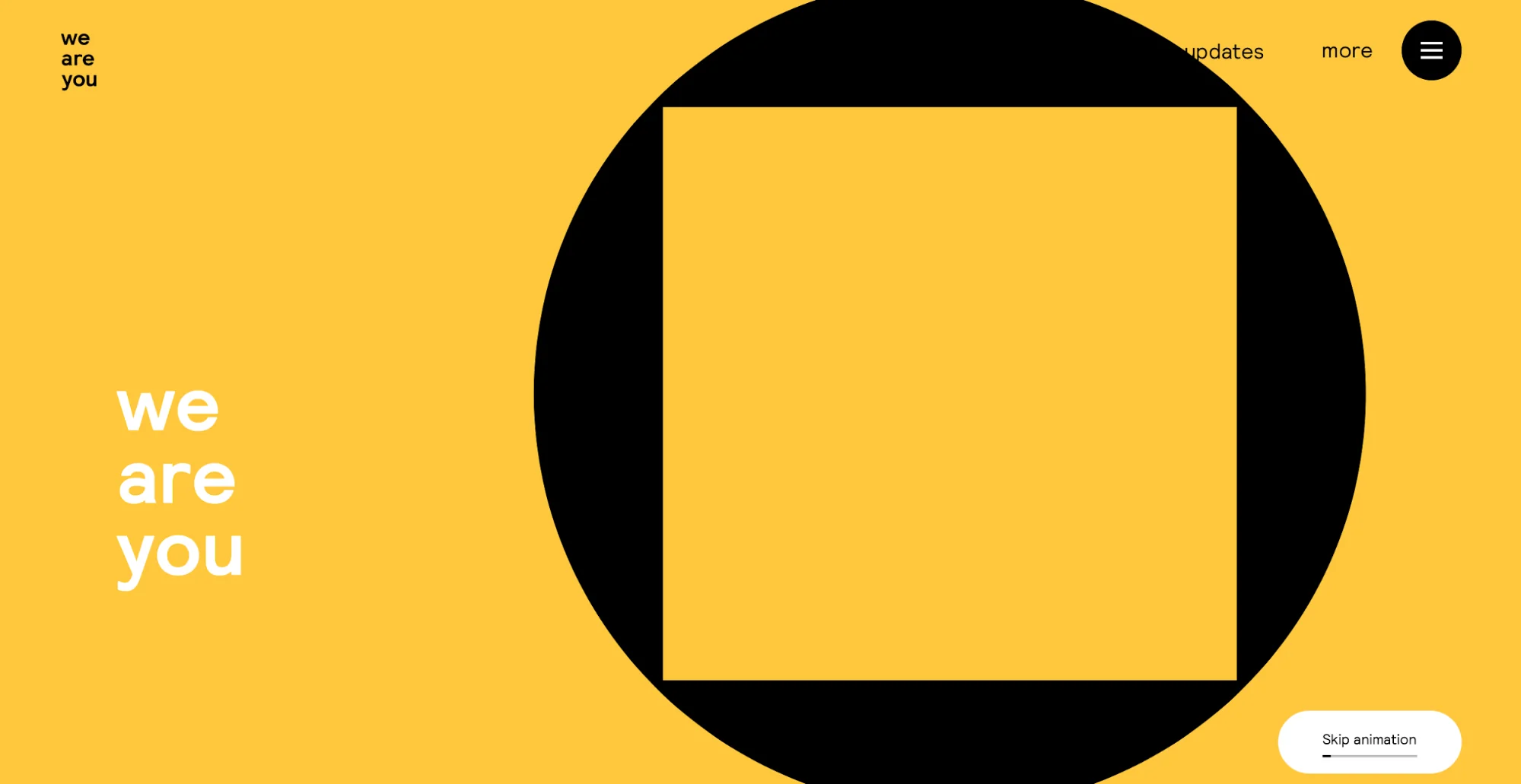
Image Credit : We are you.
Monotony is avoided with the use of black and white and keeps the design edgy.
Go easy on the fonts
Fonts just like colors convey emotions. Retro fonts for instance are associated with social posters while fonts like Hot Pizza are used in the food industry. Since minimalism is about clarity the use of different typefaces is frowned at. Instead simple typefaces expressing a particular feel are favored.
Using fonts for minimal graphic design is no rocket science. Here are simple rules you can follow when using fonts for a minimal look.
- Use simple and legible fonts. Follow the font size rule: 14-16 pt for body text, and 12-14 pt for secondary text, keeping at least a 2 pt difference between the two.
- A minimal design should contain no more than one font. You can use font weights and sizes to achieve font contrast. Going this route? Try modular scale for making the correct choice on font hierarchy. Avoid using fonts nonrelevant to your design e.g. Sanserif fonts for cosmetic brands. Software like emotype provides you with a list of fonts to use according to the emotion you select.
- Vary text hierarchy. Placing information at differing positions and breaking long bodies of text creates a minimal look. makes your minimal font use more interesting. A modular scale is a great tool for text hierarchy and shows you how to place your text.

Image credit: Desygner
Font pairings sometimes can be a necessity. If you face this route try using Fontjoy to determine the best fonts to achieve the most pleasing look.
Use Negative space
Negative space is the space around elements in a design. It’s the amount of space not occupied by an element as opposed to the positive space i.e. space occupied by an element.
The use of negative spaces adds sophistication to a design and is a powerful tool for graphic designers; when used correctly negative space highlights crucial details like sign-up buttons, and thus interactions.
Negative space must not be white space as shown in creative agency’s Huge front page design.
Be wise in your Proportions.
The relationship between the sizes of elements in design is proportion. While dealing with minimalism in graphic design, the actual size of a particular design element may not be significant but the relationship to the size of other elements is of utmost concern.
To ensure elements are in proportion use the ruler system on your design software. Most like Adobe Photoshop have alignment hints embedded.
Here are some guides in using proportion to achieve a minimal design
- Larger elements show the increased importance
- Playing with sizes can be humourous e.g An adult smaller than a child in a comic book
- Making elements the same size infuses harmony.
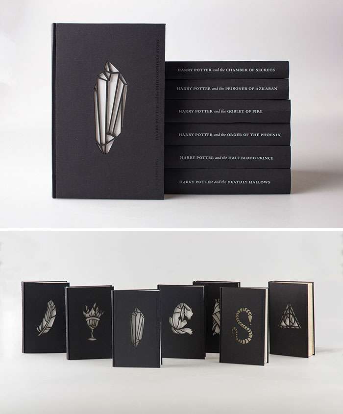
The minimalist look of the famous Harry Potter series.
Minimalism trends to watch out for in 2023.
Limiting elements for striking designs is the core of minimalism and it won’t change anytime soon. However, from this principle s few trends have emerged check them out for inspiration.
Flat design: A trendy style in minimalistic graphic design that eliminates unnecessary elements like gradients and shadows to create a two-dimensional look using basic shapes. This approach enhances the user experience and saves budget
Image credit: https: Ashish Chauhan
Minimal logo: design limits the number of design elements, resulting in a modern, sophisticated logo that’s easily recognizable.
Image Credit: Digital synopsis
Minimal typography : uses simple fonts to effectively communicate messages and is often paired with minimalist design to ensure clear legibility. It’s an excellent tool for communicating complex messages or instructions.

Image credit; Visual composer
Make engaging designs with less
Yes Graphic design is a tech skill but minimalism makes up its principles.
The attention span of readers is 8.25 seconds. Minimalism can overcome this with its emphasis on delivering important elements in concise and simple-to-use ways.
“it helps me focus on what needs to be focused on without the disturbance from unnecessary details which might divert one’s attention from the core message” says oladapo, a typography designer when asked his take on minimalism
Minimalism isn’t just a functional principle; it’s an aesthetic one favored for its simplicity and the ability to leave a lasting impression.
The simple yet powerful approach of minimalism drives its use by famous brands such as Apple. And if we want to dwell on its functionality, faster loading speeds of minimal designs on the internet are a big plus.