Fonts are everywhere we look, we see them on billboard designs, prints on cloths, products we buy and even online when we use the Internet. Even without knowing, we interact with different fonts on a daily and their different styles convey messages to use even before we start reading.
Fonts are very significant to design, almost the most important factor maybe after color. A bad font can completely ruin your design even if you get every other aspect correctly. Using the right font can give your viewers a good experience while a bad one turns them away very fast. The best way to have a proper piece is to use the proper font.
What are fonts?
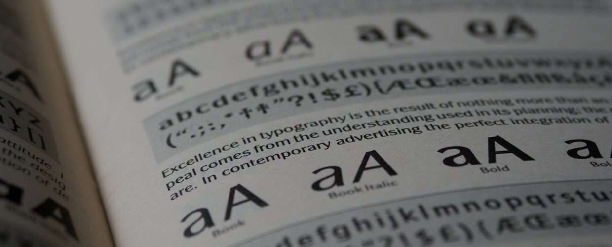
A font is a collection of characters with a similar design. These characters include lowercase and uppercase letters, numbers, punctuation marks, and symbols. Changing the font alters the way the characters look and feel.
Why use google fonts?
To demonstrate the importance of fonts, let’s say for instance, you get a flier about a deal you want. But it’s all in cursive and fancy fonts so you can barely get the info out of it. You would naturally lose interest in whatever it is you were formally interested in and maybe find a different one. If the flier was designed with simpler or more readable fonts then you’d probably prefer that.
Another instance, let’s say you are at a fancy restaurant, 5 stars and everything, and you get a menu list with fancy fonts and all. It wouldn’t feel out of place and the restaurant would even seem even fancier. Compare that to if you got a menu list with plain fonts, it wouldn’t seem as classy any more.
Fonts help the reader comprehend your content, if it is not presented properly then the information would not get across. From the example, it shows that different fonts appeal to different people based on the situation. So, it’s important to pick the appropriate one.
Google fonts is one of the best places to get fonts for whatever design you do. There are over 1020 font families (as at the time of this post) available on there for free and you get a preview before downloading. Because it is such a great source, we have collated the top fonts to use for your next design to make them really stand out.
List of google fonts, and the best fonts to pair them with
1 Montserrat
Style and Variants:
Montserrat is a sans-serif typeface with 18 styles available. It comes in three variants, Montserrat, Montserrat Alternatives and Montserrat Subrayada.
Characteristics:
This font style resembles the modernist style of the early 20th century but feels less formal than older fonts, like say, Futura. It really shines for short pieces that are written in all capital letters because of its simplicity. In lowercase, Montserrat, is still a pretty nice font with a nice height and a lot of character available.
Application and pairing:
Montserrat is good for building fun looking websites and designs, this is because it creates a majestic yet fun look to the reader. It pairs well with Libre Baskerville as a paragraph font and Crimson Text, Cardo and Hind as a title font.
2 Open Sans
Style and Variants:
Open Sans is a sans-serif typeface with 10 styles available. It comes in two variants, Open Sans and Open Sans Condensed.
Characteristics:
Open sans creates a standard look — feeling. It renders beautifully on the browser, with proper legibility and good readability. Open Sans was designed as a neutral, yet friendly appearing typeface so it looks very inviting to readers.
Application and pairing:
Open Sans looks neat and is optimized for print designs, website design, and also renders well on mobile interfaces. It is best suited for headings, however, can be used for body content also. Open sans compliments a couple of fonts including: Raleway, Brandon Grotesk, Montserrat, Lato.
3 Poppins
Style and Variants:
Poppins is one of the Geometric sans-serif typefaces, it comes in only one variant but has 18 styles to choose from.
Characteristics:
Poppins typeface has been very popular with design tools for building websites and is great for modular and minimal websites. Each letterform is nearly monolinear, with optical corrections applied to stroke joints where necessary to maintain an even typographic style.
Application and pairing:
Just like with website design, Poppins shows warmth and is very readable, suitable for titles in capital letters. The typeface pairs well as a header font with Playfair Display, Teko, Gotham, and as a paragraph font with Abril Fatface.
4 Roboto
Style and Variants:
Roboto is one of the most popular typefaces out there. It is a sans-serif typeface that comes in 4 different variants, Roboto; which has 12 styles, Roboto Condensed, with 6 styles, Roboto mono and Roboto Slab.
Characteristics:
Being used as the default typeface for Google products and Android interface, it is easily recognizable. Just as the name suggest, Roboto has a mechanical feel to it while having open curves also. It is a rounded, clean typeface with a straightforward, geometric design that offers clean lines. The elegant contrast of its strokes and sharp design makes the body text easy to read. If a robot were to write, it’d probably use Roboto.
Application and pairing:
Being a comprehensive family font makes Roboto a great choice for web design with a lot of fallback styles. It pairs well as a paragraph font with Lato, Lora, Open Sans and as a title font with Cabin, Nunito.
5 Lato
Style and Variants:
Lato is a fairly recent sans-serif typeface with only one variant and 10 styles. It was created in 2010 and has since been used across millions of sites on the internet over that time. Given its time of creation, it is very popular being the third most served font on Google fonts.
Characteristics:
Lato means summer in polish and was created with harmony and elegance in mind. The semi-rounded details of the letters give Lato a feeling of warmth, while the strong structure provides stability and seriousness creating a “friendly but serious” look.
Application and pairing:
The feel of the Lato typeface makes it suitable for any type of design or web work you want. In lower or uppercase, it excels because of its simple and clean design. Lato can be used by itself as a title and paragraph font but also pairs well with Open Sans, Merriweather, Raleway.
6 Ubuntu
Style and Variants:
Ubuntu is a sans-serif typeface that comes in 3 variants. It has Ubuntu itself with 8 styles, Ubuntu Mono with 4 styles and Ubuntu Condensed with 1 style.
Characteristics:
As you may have guessed, Ubuntu is the default typeface used in the Ubuntu operating system. It has adorable italics and is super readable. You can legibly read everything easily because the font just flows nicely, with all the benefits that clarity provides. Its horizontal width is not as wide as other fixed width fonts and you get more characters per line when writing.
Application and pairing:
This typeface was designed for clarity on desktop and mobile computing screens. It also looks very good for blogs and tech-oriented sites. Ubuntu pairs well Oswald, Merriweather, Lato but mostly Open Sans; they go together perfectly.
7 Raleway
Style and Variants:
Raleway is a sans-serif typeface that has 2 variants. Raleway, with 18 styles and Raleway Dots with one style.
Characteristics:
Raleway is an elegant typeface that is easy on the eyes and professional at the same time. Its letters feature both old and new styles with lining numerals as well as a stylistic alternate inspired by more geometric sans-serif typefaces than its neo-grotesque inspired default character set.
Application and pairing:
Raleway is very is very sharp and functional especially with large size usages like headings and page title. It pairs well as a title font with Open Sans, Carbin, Merriweather.
How do you pick the right font?
When choosing fonts for your project, always make sure it’s appropriate to the targeted audience. Looking for a font that pairs well with a lot of other fonts, try Open Sans, or a font that’s easily recognizable, use Roboto, or a techy font, try Ubuntu. No matter what type of project you want to work on, there’s a font for it; just make sure to pick the right one.
While trying to pick the right font, do note that there are certain fonts that are just generally hated like Comic Sans, Times New Roman and Papyrus. They just don’t appeal to people the right way. Also, some fonts have been overused like Arial and Helvetica, everyone uses Helvetica. Try to stay away from these ones.
When you choose the font you want, you need to remember that not every computer has every font installed on it especially fancy fonts. If you choose one of these fonts and it’s not available, the machine will display the default font instead, which will not give the look you were going for.
Using the proper font would make your work pop and definitely attract the right people to your work, so always go the extra mile when trying out font because they are very crucial to the success of your work.