
UI is the point of contact between human-computer interaction. As everything is driving towards technological advancement, every one, one way or the other interacts with a product through an interface. These include display screens, applications, and websites. Everyone wants an interface that’s easy to interact with without spending too much time or going through any stress while using it.
Since we all use different interfaces on a daily, it is very important as designers to build an interface that would properly grasp a user’s attention and give them a good experience throughout their use. To achieve this there are simple rules for UI design that have to be followed.
Users have a lot of choices and alternatives to choose from when searching for a product or service, the period you have to grasp their attention is very little so you have to be very precise and hit the bullseye during this period.
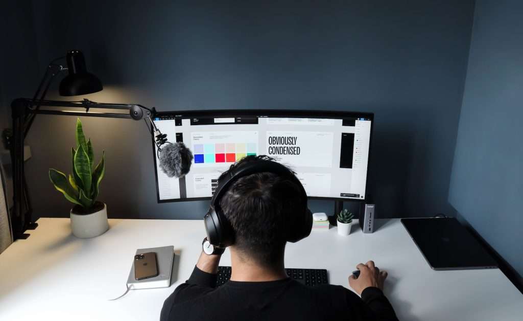
Image credit: faizur-rehman-unsplash
From a glance, a user should understand the message that is being passed across.
UI design is not just about making a design look pretty or aesthetically pleasing; it is responsible for the first impression and the general experience when using a product. First impressions are very important when trying to gain users and bad ones are often long-lasting. This is something that shouldn’t be taken lightly.
While designing a user interface, there are a couple of UI design rules to keep in mind. We have made a list of these simple rules for UI design. Follow them to deliver a pleasant experience for users.
1.Use whitespace:
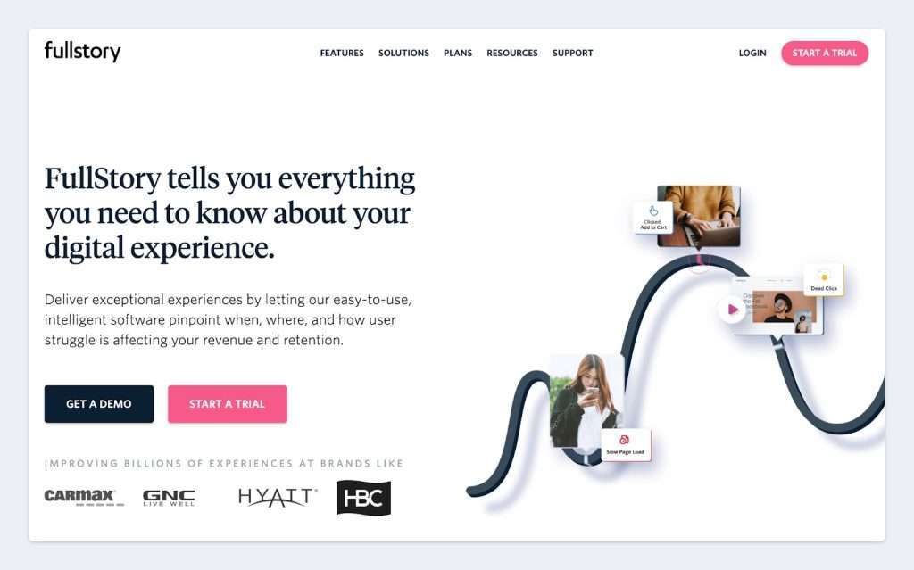
Image credit : Adobe XD
White space is the area between all design elements. It may be referred to as negative space or blank space but they all mean the same thing i.e the space within separate design components, including the space between fonts, pictures, buttons and all screen characters.
Even though it’s termed “whitespace”, it does not necessarily have to be white. Whitespace could be in any color, texture, pattern or even a background image.
The importance of whitespace in design cannot be overemphasized, it has numerous benefits both to the designer and the user.
Its a simple rule for UI design you can’t afford to miss. Here’s why:
- It improves the users’ comprehension,
- Focuses their attention to specific components,
- Guides the user by grouping elements
- It shows the hierarchy of content since the more white space around an element, the higher it’s importance.
Pro Tip: If you feel your design looks congested, it probably is, add a little more whitespace.
2.Make it accessible:

Image Credit: Share.america
Accessibility is very important in design because users with challenges should have access to your design.
Its about making sure
- The colors picked for the design are proper,
- Font sizes are legible
- Contrast and elements for making the design available to a range of users is prominent.
Accessibility should not be mistaken for usability.
Usability is also a very important factor when designing but it is often mixed up with accessibility.
Usability is concerned with how easy it is to interact with a design, it’s effectiveness and efficiency; generally, if a design is satisfying.
While accessibility, on the other hand, is concerned with ensuring every user enjoys interaction with a design, regardless of their challenges.
You might think accessibility is not a necessary a rule for UI design since it has nothing to do with aesthetics. Remembering this rule when creating experiences allows a wider populace the chance to interact with your design. It might even make life easier for them.
3.Be consistent:

Image Credit: pexels-julia-filirovska
Great user experience is derived from consistency.
Consistency ensures the elements in a design look uniform and behave the same way. When a user interacts with your design, they should be able to understand and simply use it, as they proceed, they shouldn’t have a tough time interacting with your design. This means your design even when new should be intuitive and contain familiar elements. l
Consistency eliminates confusion from using your design and shows uniformity.
Imagine if the red is bad and green is good concept changes in your design ? what would a user’s experience be ? The user would quickly get confused and the next step is… frustration.
Consistency is achieved by using similar visuals like typography, color, spacing and other screen elements, a consistent voice and tone of delivery and a familiar pattern across the design. Setting out a guideline to follow when designing or using a design system is a great way to maintain consistency in your design.
4.Ace your font game:
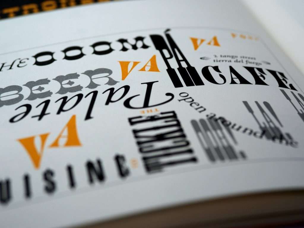
Image credit: brett-jordan-unsplash
Typography is an important rule for UI design.
They play a very crucial role in the success of a design. By picking the right font, you improve readability, accessibility and usability of the design.
When deciding on a font for a design, there are a couple of factors that should be considered
- Purpose of the design. This has to do what kind of message is being passed across.
- Legibility of font. Based on the type of the design, a stylish or plain font.
- The font family. Whether or not the typeface has enough fallback fonts and multiple styles.
- Target audience. The font has to match the audience to effectively pass the message.
Acing your font game would mean you properly pick the font for a design. You have to avoid using too many fonts in the design. This can easily make the design look crowded and confuse the users’ focus, less font is better.
When you pick fonts, pair them with complementing fonts that make them look better. This is very tricky as there are fonts that are better as header fonts and some as paragraph fonts. Avoid pairing similar fonts as this defeats the entire purpose of complementing them.
5.Use the correct Color:

Image credit: pexels-magda-ehlers
The color of the design is very important when creating the impression for a design. The color used would influence how the user reacts to the design immediately. Depending on the color, the user feels a range of emotions that influences their experience with the design.
Understanding color psychology would help you when picking the color for the design.
Different colors portray different emotions:
- Red depicts urgency and danger,
- Blue depicts peace and stability,
- Yellow depicts joy and optimism,
- Green depicts safety and growth.
All the different colors portray different emotions so you should do enough research into the colors you pick for your design.
Color, just like other components of design, is extremely important. It is not just the cherry on top of the cake, but the glue that holds the entire design together.
Craft seamless experiences with these simple Rules for UI design
The purpose of UI is to properly represent the design process a user would interact with by improving its presentation and interactivity. The best interface is one that is direct, simple and easy to control.
A user should be able to use your design seamlessly without having to think of the complexity, so something to always keep in mind is “can the design be simpler?”.