

The use of the right color improves brand perception by 93 percent alone!
. That’s right! Eye-catching graphics play a crucial role in grabbing the attention of humans who are visual creatures. But there’s more to it than just fancy colors and graphics.
The color psychology in graphic design is Can End A Project.
And Here’s why:
Colors aren’t just fancy. They have meanings and interpretations that vary across cultures and genders. For example, did you know that the color white is associated with peace, but in Asia, it refers to death and mourning? Or that users who have had traumatic experiences with a yellow car are likely to distance themselves from a brand with the same color? And while black is the color of elegance, it’s strange in clothing brands associated with children!
These cool color facts about color psychology in graphic design show that colors have different representations, and their misuse can end a graphic design project, regardless of the skill or investment made in it.
In this article, we take a deep dive into color psychology in graphic design, gender, and cultural color guides you should know, and quick tips on how to arrive at the right color type for any project.
So Buckle up because we’re about to take you on a colorful journey full of excitement and cool color facts!
Why is color psychology in Graphic Design Crucial?
When designing characters, artists utilize the power of color to build a persona like in the 2021 popular Dawn of Justice where the superhero Superman ditches his red and blue suit for a black one to signify his loss of control. This choice of color is a medium for building perception and communicates the state of things better than words. This is why color is crucial to designers; it effectively triggers perception and when mastered is a tool for evoking desired emotions e.g. desire for goods and services.
Building connections with audiences start from perception. Knowing what colors mean, is half the job of connecting to your audiences in an impactful way.
Here are 6 popular Psychology of color in Graphic Design Hacks
1. Red color psychology in Graphic Design:
The color of excitement, desire, war, Passion, desire, energy, war, victory. The color is amongst the oldest known to man as proven in cave paintings. Later civilizations like the Egyptians associated this color with victory and in Rome, conquest.
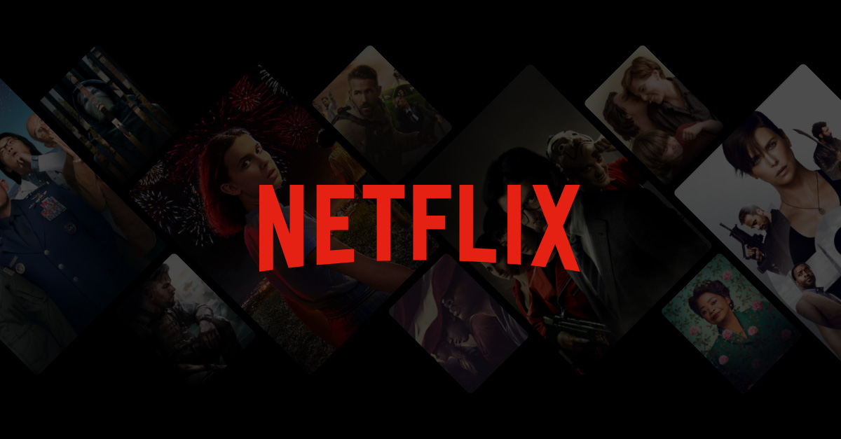
Popular streaming service Netflix likely used it as a statement that it was conquering the pre-existing form of movie consumption and needed a brand that could attract attention all by itself.
When to use the color red in graphic design:
- Call-to-action buttons. It’s boldness and high visibility make it a good choice for buttons that encourage users to take action, such as “Buy Now” or “Sign Up Today.
- food and beverage branding. Evoke appetite and desire to purchase food products and motivate sales.
- Warning or caution signs: Draw attention to potential hazards or safety concerns. For example, red is used in stop signs, “Do Not Enter” signs, and “Danger” labels.
- Healthcare: Red is sometimes used in healthcare to represent urgency and importance. It can also represent love and passion in relationships.
- Entertainment: Used in entertainment to represent excitement and passion. It is commonly used in movie posters and advertising.
Good and bad interpretations of red across cultures:
While red is generally viewed positively across many cultures, it can have different interpretations and meanings depending on the context and region. For example, in Western cultures, red is often associated with love and passion, while in some Eastern cultures, it can represent luck and prosperity. In some African cultures, red can be associated with danger and warning.
Interpretations of red across genders:
In terms of gender, red is often associated with femininity in Western cultures, while in some Eastern cultures, it can be associated with masculinity. It is important to consider cultural and gender associations when using color in design to ensure that the intended message is effectively conveyed.
2. Green color psychology for graphic design
The color of renewal, energy, life, reliability, sustainability, Envy, Jealousy, and Evil. It was considered a symbol of rebirth, growth, and fertility. In the Middle Ages, green was associated with love and the hope of new life. In the 19th century, green was used in art to evoke a sense of tranquility and relaxation.
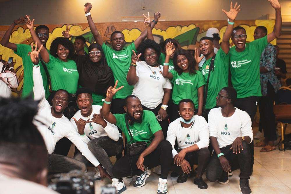
Image Credit: NGD
Your favorite team for all things design – NGD uses green to represent growth and sustenance to the design community and to communicate reliability in our offerings.
When to use the psychology of green in graphic design:
- Eco-friendly designs. Green is associated with nature, making it the perfect color for eco-friendly designs that promote sustainability and environmental awareness.Health and wellness: Green is a calming and soothing color, making it a great choice for health and wellness designs such as spas and yoga studios.
- Financial services. Green is also associated with money and wealth, making it a popular choice for financial service designs such as banks and investment companies.
- Food and beverage. Green is commonly used in the food industry to represent freshness and natural ingredients, making it a great choice for designs related to organic foods and healthy eating.
- Educational materials. Green is often used in educational materials to represent growth, learning, and harmony.
Good and bad interpretations of green across cultures:
In Western cultures, green is generally associated with growth, balance, and harmony. However, in some Eastern cultures, green can be associated with jealousy and infidelity.
Interpretations of green across genders:
Green is considered a gender-neutral color and is often used in designs targeted toward both men and women. However, in some contexts, green can be associated with masculinity, such as military uniforms and sports team logos.
3. Blue color psychology in graphic design
calmness, trustworthiness, and professionalism. Its history dates back to ancient times when natural blue pigments such as lapis lazuli were highly valued and used in artworks and decorative objects.
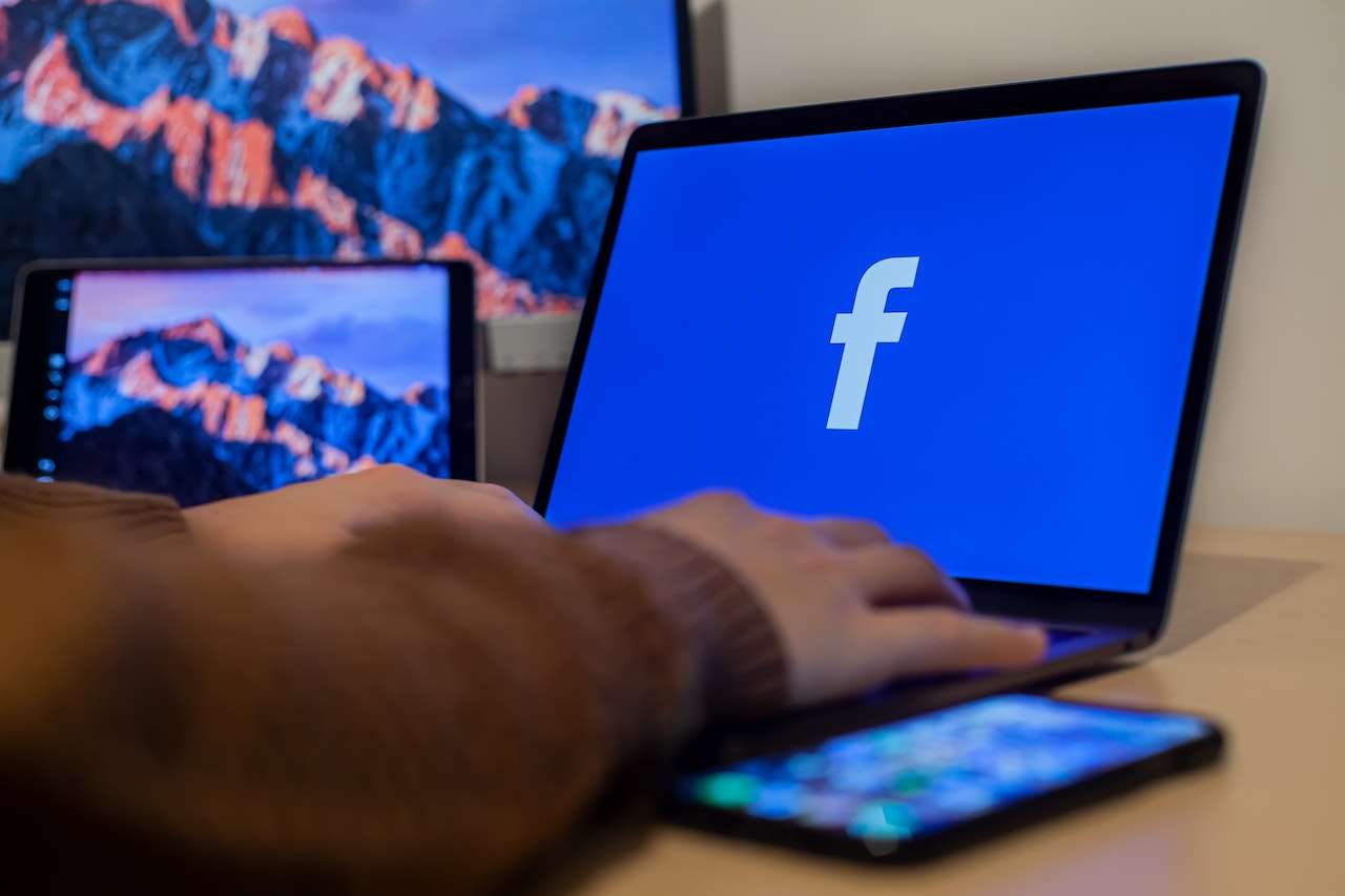
Image Credit:-luca-sammarco-
multibillion-dollar company Facebook has leveraged the friendly vibe of blue to market communication to its customers.
When to use the psychology of green in graphic design:
- Corporate branding. Blue is often used in corporate branding because it communicates professionalism, reliability, and trustworthiness. It is a safe and conservative choice for businesses in industries such as finance, law, and technology.
- Healthcare. Blue is commonly used in the healthcare industry because it is associated with cleanliness, sterility, and healing. It is often used in medical packaging, hospital signage, and doctor’s office décor.
- Environmental causes. Blue is often used in designs that promote environmental causes because it is associated with nature and the environment. It is also used to represent water, air, and sky.
- Technology. Used in the tech industry because it represents innovation, intelligence, and progress. It is often used in the logos and branding of tech companies such as IBM, Intel, and Facebook.
- Fashion: A timeless color in the fashion industry and is often used to represent luxury, elegance, and sophistication. It is a versatile color that can be used in both casual and formal clothing.
Interpretations of green across genders:
In terms of gender, blue is often associated with masculinity in Western cultures. However, this association is not universal, and in some cultures, blue is considered a feminine color. It is important to consider cultural and gender associations when using color in design to ensure that the intended message is effectively conveyed.
Good and bad interpretations of green across cultures:
While blue is generally viewed positively across many cultures, it can have different interpretations and meanings depending on the context and region. For example, in Western cultures, blue is often associated with calmness and trust, while in some Eastern cultures, it can represent sadness or mourning.
4. White color Psychology in graphic design
The color of purity, innocence, and clarity. It has been used in art and design for centuries, the earliest known use its earliest known use in ancient Egypt. In the design world, white is often used to create a minimalist and modern look.
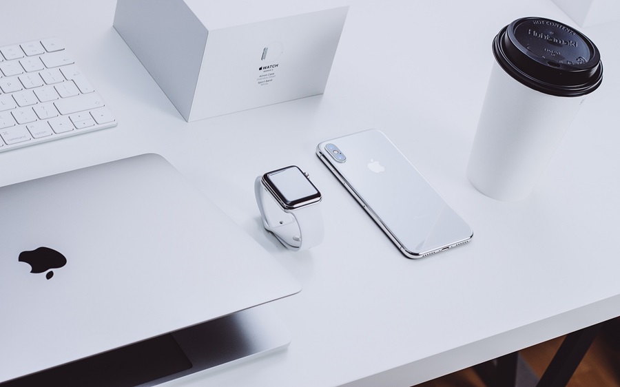
Image Credit: Apple Inc
Tech company Apple favors white for a sophisticated and distinguished look.
When to use the psychology of green in graphic design:
- Minimalist design. White space is a key component of minimalist design, and it can help to create a sense of elegance and sophistication. Minimalist design is often used in high-end fashion, architecture, and luxury branding.
- Medical design. White is often used in the medical industry because it is associated with sterility and cleanliness. It is used in the design of medical packaging, hospital signage, and laboratory equipment.
- Wedding design, White is a traditional color used in wedding designs, representing purity, innocence, and new beginnings. It is often used in invitations, wedding dresses, and floral arrangements.
Interpretations of white across genders:
In many cultures, white is considered a gender-neutral color, but it can have different associations depending on the context. For example, in Western cultures, white is often associated with purity and innocence, which can be seen as more feminine traits. However, in some Eastern cultures, white is associated with mourning and can be seen as more masculine.
Good and bad interpretations of white across cultures:
White is generally viewed positively across many cultures, but it can have negative associations in certain contexts. For example, in some cultures, white is associated with death and funerals. It is important to consider cultural associations when using white in design to avoid unintentionally conveying a negative message.
5. Yellow color psychology in graphic design
Yellow is a bright and sunny color that is often associated with happiness, optimism, and warmth. It has a long history, with evidence of yellow pigments being used in art and decoration as far back as ancient Egypt.

Image Credit: Bumble
Dating platform Bumble uses yellow to spark excitement about interacting with others.
When to use the psychology of yellow in graphic design:
- Children’s products. Yellow is often used in designs for children’s products because it is bright, cheerful, and playful. It can be used to convey a sense of fun and energy that appeals to young audiences.
- Food and beverage. Yellow is also a popular color in the food and beverage industry because it is associated with freshness and sweetness. It is often used to represent citrus fruits, honey, and other flavorful ingredients.
- Retail. Yellow can be an effective color in retail environments because it attracts attention and creates a sense of urgency. It can be used to highlight sale items, limited-time offers, and other promotions.
- Sports. Yellow is a popular color in sports branding because it is associated with energy, speed, and excitement. It is often used in the logos and uniforms of sports teams.
- Travel and leisure. Yellow can be used in designs for travel and leisure industries because it conveys a sense of warmth, happiness, and relaxation. It can be used to represent sunny destinations, beach vacations, and other leisure activities.
Good and bad interpretations of yellow across cultures:
In many Western cultures, yellow is associated with happiness and optimism, but in some Eastern cultures, it is associated with cowardice or betrayal. It is important to consider cultural associations and context when using yellow in design to avoid unintentional negative connotations.
Interpretations of yellow across genders:
It’s common to find the color yellow associated with femininity in the West. The East, however, regarded yellow as the exclusive of nobility i.e. kings and warriors.
6. Purple Color Psychology in Graphic Design
Purple is a complex color that has been associated with royalty, luxury, and spirituality throughout history.
Its use dates back to ancient times when it was obtained from the mollusk, and it was a rare and expensive dye used only by the elites. In contemporary times, purple is often associated with creativity, innovation, and eccentricity.

Image Credit: Pexels -Lee Mills
Global courier company FedEx deals with sensitive belongings and uses the color to convey confidence and respect to customers.
When to use the psychology of purple in graphic design:
- Luxury brands. Purple is often used in luxury branding because it is associated with opulence, extravagance, and sophistication. It is a popular choice for high-end fashion, beauty, and jewelry brands.
- Creative industries. Purple is also used in the creative industries, such as advertising and media, because it represents imagination, originality, and uniqueness.
- Spiritual and wellness industries. Purple is associated with spirituality, mindfulness, and wellness. It is commonly used in designs for yoga studios, meditation apps, and wellness retreats.
- Children’s products. Purple is a popular color for children’s products because it is playful, whimsical, and imaginative. It is often used in toys, cartoons, and educational materials.
Good and bad interpretations of Purple across cultures:
In Western cultures, purple is often associated with femininity, luxury, and royalty. However, in some African and Asian cultures, purple is seen as a masculine color and is often worn by men.
Interpretations of Purple across genders:
Designers in Asia often use the purple color for failed attempts since here it denotes bad luck. In Brazil, however, Purple is synonymous with good luck and would be used in UI where users won sales or discounts.
Picking the right color for a brand.
Using colors accurately can be daunting but there’s a quick guide based on the persona of your brand. What’s a brand persona? Think of it as the character of your brand, the traits your brand will like to communicate to target audiences.
According to Personality expert Jennifer Asker a brand just like people can have these 5 traits.
Sincere: Brand conveying honesty and values openness with its customers. Popular colors are Blue and Purple,
Excitement: An exciting brand is daring, bold audacious. Colors reflecting this are red, orange, and yellow.
Competence: Trustworthy, reliable, stable. Colors reflecting this are Green and blue.
Sophistication. Classy, unique, Luxurious. The colors reflecting this are purple and Green.
Ruggedness: Tough, Earthy, Stable. The green color reflects this well.
Picking the right color according to the region
Here’s a quick guide on how the colors mentioned in this post are viewed across regions to enable you make smart decisions when designing for an audience abroad.
| Color | Positive Associations | Negative Associations |
| Red | Love, passion, luck (China), celebration (India) | Danger, anger (Western cultures), warning (Western cultures) |
| Green | Nature, fertility (Islamic cultures), luck (Ireland) | Envy, inexperience (Western cultures), jealousy (Western cultures) |
| Blue | Calmness, serenity (Western cultures), spirituality (Hinduism) | Sadness, coldness (Western cultures), mourning (Iran) |
| White | Purity, innocence (Western cultures), mourning (China) | Sterility, emptiness (Western cultures), death (India) |
| Yellow | Happiness, joy (Eastern cultures), courage (Japan) | Cowardice (Western cultures), deceit (China) |
| Purple | Royalty, power (Western cultures), spirituality (Thailand) | Excessive pride, arrogance (Western cultures) |
Increase sales with the simple power of color psychology in graphics design.
Typography and design rules are great tools to have in your bag, but knowing the psychology of color in graphic design helps you create stunning visuals that attract attention and ultimately sales for clients. It could also save you from deep diving into projects with colors that are opposed to a project e,g white for food brands or blue for luxury brands.
When choosing colors for design projects pay attention to the region your design is to be used. Noting the colors used in similar works is a good way to avoid using conflicting colors or colors that are associated with negativity in the region. You can also use smart color tools to generate color combos that work for any project and save yourself some time.
The rules can be varied though as shown in this article where brands with blue were perceived as more eco-friendly than brands with Green. As usual, knowing the rules first is essential before breaking them!